Baby Boom Is Our Aesthetic

If Baby Boom (1987) isn’t on your pre-Valentine’s Day rom-com lineup, it should be. It is the romantic comedy for cozy, wintery-but-not-Christmas vibes. First of all, it’s a Nancy Meyers flick so you know the kitchen’s gonna be on point. Second, it’s from 1987 and lovingly skewers the aspirational yuppies of the era – including a wholesome, organic baby food business that would STILL draw the devotion of upper-class yummy mummies today. Third, it has all of the romcom features you’ve come to know and love: a career woman who doesn’t have time for love! Unexpectedly becoming the custodian of a baby! A handsome man with a romcom job! A charming old farmhouse with problems! I am the same age as Baby Elizabeth, so the sweet pastel baby clothes are like looking into an old family album. For some reason Baby Boom seldom comes up in conversation about ’80s romcoms, but give it a watch or rewatch … it just might be your February romcom aesthetic, too.

The opening new segment

Women have jobs! They’re doctors AND lawyers! Ladies having it all! It’s SO ’80s. The higher the shoulder pads, the more cushion busting through the glass ceiling?

J.C. Wiatt (Diane Keaton) works 70-80 hours a week. I’d rather be middle-class.

J.C.’s menswear-y satin robe and tortoiseshell glasses

It’s like she might get called to a board meeting pajama party and she dressed for it just in case.

Spoiler: her robe gets more cozy when she inherits a baby and moves to New England

Elizabeth’s  and J.C.’s “Inheriting A Baby Outfits”

J.C. inherits a baby, which is truly my dream scenario – not having to be pregnant, go through all the steps of fostering or adoption, or make an affirmative decision about whether or not I want a baby. Elizabeth (Kristina and Michelle Kennedy) wears a classic baby coat and hat and J.C. wears my favorite of her businesswear outfits, with a floppy bow, Peter Pan collar and oversized belted jacket that has almost Edwardian vibes. The shoulderpad/belt combo makes her waist look tiny, so that’s why people used to do that. She changes back into it at the end to turn down the offer to buy her baby food company, because it’s her main outfit to do important things in.

Another great one. When did we stop wearing brooches?

P.S., I get that J.C. has never held a baby before, but she has presumably held an object before and this isn’t how you do that, either.

By the way, J.C. name-drops two local-for-me companies, reminding me of how awesome my city was doing in the ’80s, comparatively.

Elizabeth …. MUDGE?!

Elizabeth almost gets adopted by two dustbowl people who come straight out of the Fake Annie’s Parents lineup in the Warbucks mansion. J.C. can’t do it. Guess she has time for love after all.

These Spiky Moms

These moms are all live-action versions of Angelica’s mom from Rugrats. They go on at length about all of the activities their toddlers are enrolled in and the extensive intellectual standards their 3-year-olds have met. Hey baby boomers, if you don’t like millennials just remember that you made us this way.

Hadleyville, In General

J.C. and Elizabeth arrive in town during the fall because Nancy Meyers knows what’s up. There’s a general store and a church, and it looks like a living history museum.

I love that J.C.’s plan for what they’ll do in New England is “get into quilts,” which should be timeless but feels very 80s Businesswoman Who Has Had It.

J.C.’s Yellow Farmhouse, Exterior

J.C. buys a dollhouse-looking yellow clapboard farmhouse. I want it. It’s cheerful and sweet with tasteful landscaping. There are window boxes and real shutters! However, the plumbing is shot and will cost $7,000-8,000 which feels steep for 30 years ago? For reference I recently repiped only my basement (copper, because go big or go home) and it was maybe like $1,500. Oh, and she also needs a new roof and well. But it looks so nicely-maintained?

It’s even cuter in spring because this house was made to have tulips and rabbits around.

As usual, our __ Is Our Aesthetic posts feature movies with absolutely delightful houses. That’s why images of the Baby Boom house will take you to the Hooked On Houses post for this film. It’s one of my favorite blogs and they do a great job highlighting some of the most charming homes in TV and film.

J.C.’s House During The Snowstorm

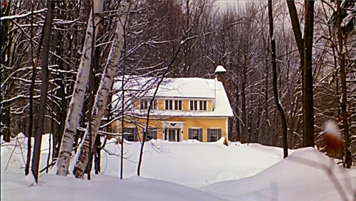
Living in a snowy city, sometimes it takes seeing it onscreen to remember how pretty it is.

The Richies From NY

Some rich people go to the local general store and can’t get enough of the authentic boots, plaid shirts, and baby food that J.C. made. They’re exactly like the 2018 version of yuppies, honestly.

The whole movie feels really modern because the home business is so familiar today — but in a time before Pinterest/Etsy moms and Whole Foods in every city, J.C. was seriously cutting edge. When I was watching I was reminded of a later Nancy Meyers film, The Intern, and apparently that was no mistake. The kitchen from The Intern even echoes the muted blue cabinets from Baby Boom!

The Hadleyville maple festival

This small-town maple festival is exactly how I want my parties. All the ladies wear big Sloane Ranger dresses, there are twinkling lights, and everyone just kind of talks and has snacks. There’s a mural with a barn and some geese on it. Nobody’s suit fits right. Get into it.

J.C.’s Nancy Meyers Kitchen

Nancy was still new to the charming romcom kitchen game in 1987, but all her talent was there from the start. Vintage-style fridge, exposed ceiling beams, baskets, fireplace and clapboard. The cabinets are painted the exact powdery blue I keep seeing in chalk paint now. Windows everywhere. There’s enough space for a work table, an eating table, a couch, hutch and a rocking chair, plus space to tap dance around all of them if you’re so inclined.  The cabinet fronts are fitted with gingham. J.C. and the handsome vet have their first kiss in the kitchen because all any woman wants is to have a first kiss in a Nancy Meyers kitchen.

The Yellow Farmhouse, Interior

First of all, I love how the woodwork isn’t perfectly freshly painted, so it looks like someone actually has lived there a long time. Second, check out these wood floors, comfy Laura Ashley-looking furniture, natural light, and worn-in looking antiques.


Advertisement

Fake Hygge Things That Sound Plausible

If you read design blogs – and as a young single homeowner, I can assure you I do – you must have heard of hygge. Hygge is the Danish concept of – to quote The New Yorker –  a “quality of cosiness and comfortable conviviality that engenders a feeling of contentment or well-being.”

Over the past few years, hundreds of books, articles and blog pieces have suggested ways to introduce some hygge into your life. Especially in the winter, there are suggestions for cheerful game nights, mulled cider in front of the fire, soft cashmere throws and the glow of candlelight.

There are also some very specific and strange suggestions, like the all-day Star Wars marathon at home with 5 kids that one blogger suggested.

The following are some totally made-up hygge things that I would somehow not be surprised to find during my design blog reading:

Go to YouTube and search for songs from your favorite musicals + “figure skating.” Make a playlist. Watch them all.

The other day I thought “you know, I bet you could search YouTube for ANY song from a musical plus the term “figure skating” and get a result.” THEN I thought “that legitimately sounds like something a blog would suggest as a hygge activity.” Then this whole thing happened.

As a treat, put on an extra pair of socks

Solve a decades-old murder using information readily available on Google

Nothings cozier than sitting in your favorite chair and finally getting down to business on what happened to JonBenet … only to see that three hours passed in an instant and you still DON’T KNOW.

Watch a birdfeeder from a window while you wear a big sweater

Have your boss over for a Dutch Blitz party. Serve those windmill cookies. You know the ones.

Since I wrote this draft, Dutch Blitz has shown up in my Amazon suggestions. I guess Amazon’s hygge activity this winter is tracking my every step on the internet. Hey guys! Loved Mrs. Maisel.

Play Hot Potato with an actual hot potato

Replace the harsh overhead lighting in your office with a bunch of candelabras

Skip the nightly news and have each member of your family read articles from the day’s newspaper out loud

It’s just how people had their existential crises in the 1800s!

Invite all of the stray cats from the neighborhood in and invite your pet-lover friends over for Hygge Cat Night

Go caroling, except with non-Christmas wintery songs

Your neighbors will feel very hygge when you sing them It’s A Marshmallow World In The Winter on a Tuesday in February, and you know what? So will you.

Sit around the fire and everybody has to say what they would name a baby right now.

Go to a small hunting cabin and have a soup contest.

This isn’t so much a fake hygge thing, as much as a real upstate NY thing my parents do with their friends.

Have a Friends marathon, but with reading the scripts out loud instead of watching the show.

And THIS isn’t so much a fake hygge thing, as much as a real thing we did on our school trip to Spain in high school.

Spin a globe and wherever your finger stops, you have to pretend you’re in that place for the night.

Put all of your blankets on the floor, one on top of the other. Now all your blankets are wearing blankets.

It’s hygge but for blankets.

Speaking of blankets: blanket fort.

Things I Think Every Time I Watch ‘Fixer Upper’

Fixer Upper is nailing up its last shiplap after the fifth season. Obviously Chip and Joanna have plenty going on, and somebody has to … fill the silos with subway tiles, or whatever it is happens in Waco… so we don’t begrudge them taking a break. But since Fixer Upper, along with the Great British Bake Off and Bob’s Burgers, is one of my Adult Sesame Street shows (gentle, soothing, predictable and sweet) – well, I’m happy I have one more season to think the following things every single time I watch:

Why does my house have walls?

A common theme in older homes: walls are used to divide areas into separate rooms. Which sounds obvious, but by the end of an episode of Fixer Upper I’m always questioning why some Edwardian dummy put a wall between my dining room and kitchen.

[Although, I don’t have to look at my dirty pots and pans while I’m eating, so I’m pretty sure walls are great.]

These people don’t REALLY want ‘the charm of an old house.’

Episode after episode, I see a homeowner wax poetic about the “charm” of old houses. I agree! My house is 108 and my parents live in an 1830s farmhouse. But more often than not, during the Fixer Upper reno process walls get taken down, moldings get swapped, a new fireplace is fitted, flooring is changed… y’all could’ve gussied up a 1980s cul-de-sac special for the same (beautiful) result.

Shiplap, huh.

The only thing I love as much as Joanna Gaines loves shiplap are my family and Jesus. I kid, sort of, but has anyone done a pie chart of how many Fixer Upper homes use shiplap? No, because it would just be a circle all filled in with one color.

Food for thought: dealing with the old owners’ shiplap is going to be to 2040s remodeling what dealing with old owners’ wood paneling is to 2010s remodeling.

What time is it? It’s BIG CLOCK O’CLOCK!

It’s always Big Clock O’Clock in a Fixer Upper house.

This is what 2010s decor will look like to people from the future.

You know, like how 70s looks like shag carpeting and orange/avocado/brown appliances, and 60s looks like mid-century Mad Men (but PSYCH! most suburban middle-class ’60s homes were kind of Colonial Revival-y), and the 90s looks like country geese and sponge paint?

In period films set in 2015, but made in 2035, it’s going to be light gray walls, shiplap, barn doors, subway tile, open floor plans, industrial lighting and exposed wood beams.

Easy, Chip.

At least once an episode. Different reasons each time.

I could move to Waco.
I  can’t move to Waco.

Maybe just a field trip.

What if Joanna Gaines and Nancy Meyers teamed up?

The Intern, possibly my favorite Nancy Meyers kitchen but don’t quote me on it.

Ain’t no kitchen like a Nancy Meyers kitchen cuz a Nancy Meyers kitchen is ABSOLUTELY CHARMING.

I would absolutely watch a show where Nancy Meyers and Joanna Gaines team up to give people kitchens worthy of a lead in a rom-com. The reality show could be kind of a rom-com itself, wherein the homeowner always finds love or herself by the end.

There is no way you cook that much.

Every time somebody needs a double-oven and an island this size of a literal tropical island and they have two kids.

There is no way you pee that much.

Every time someone needs 4 bathrooms and they have two kids. Maybe it’s because I grew up 6 people to one bathroom, but a bathroom per person is bonkers.

[Of course, I live by myself, so I DO now have a bathroom per person, and I can confirm that it is amazing.]

Can they sell one of these whole kitchens at Target?

I’m really excited about the Target Hearth & Home collab, but also I don’t want a sign that says “Farmhouse” or “Eggs 5c,” I want an entire Gaines-ified kitchen; too much to ask?

I wonder what’s under my floors.

My house is all hardwoods, except the kitchen and bathroom. But are there hardwoods UNDER the kitchen flooring?

I found out the hard way that the answer is yes, but it’s actually under a vinyl floor, sheet linoleum, a subfloor, other sheet linoleum, ASBESTOS I THINK, and then another subfloor. So I don’t actually think this when I watch Fixer Upper anymore now because I bit that apple. I bit it hard.

By the way, do you want to know what’s in my rafters? Very old haunted-looking newspapers that seem like they’re a clue or something. I assume someone name Bertha or Sherman stashed them there in 1911 just to mess with me.

Joanna has great hair.

At least once an episode I’m struck by how shiny and frizz-free Jojo Gaines’s hair is.


The Parent Trap Is Our Aesthetic

It’s summer, and our aesthetic is The Parent Trap (1998): a rustic cabin in a pine forest, a kicky new summer haircut, a sedate London home, secret twins, a sprawling Napa estate, getting your ears pierced by a child, comfy yet timeless sundresses, midafternoon dips in the pool with your dad’s too-young fiancee, casual camping gear, finding out your parents were totally OK with never seeing one of their children again… The Parent Trap has it all.

Although remakes usually pale in comparison to the original, The Parent Trap is different. The Hayley Mills version is fine, but it’s the Lindsay Lohan adaptation that I go to time and time again. It came out when I was 11 – the same age as Hallie and Annie, and could have passed as their triplet – and although almost two decades have gone by, it feels ageless. It’s no mistake that this is our second “___ Is Our Aesthetic” post featuring a film from Nancy Meyers, romcom queen and kitchen guru extraordinaire: all of her movies feel fresh and current when they come out, and thanks to her use of timeless and playful styling, they stay that way.

The Entire Camp Experience

I never went to sleepaway camp: not rich enough to afford it, nor poor enough for a scholarship (even at 11, I was able to recognize that the Parker-Jameses were seriously loaded). But maybe that’s for the best, because I am free to imagine summer camp exactly as it is in The Parent Trap. Camp Walden is everything you expect in a New England summer camp. Nestled among tall trees, the girls really do bunk in rustic cabins, wake up to bugle calls, eat at a mess hall, swim in a lake, hold unsupervised poker tourneys and engage in elaborate prank wars.  It’s the kind of low-tech, high-fun camp I could imagine generations of the same family attending.

Even the preppy-yet-simple uniforms are great, and those little touches like how Annie always chose the more formal version: the polo shirt instead of the tee, for instance.

To get it out of the way: those twin scenes were filmed with the help of Erin Mackey, Lindsay’s double and now a theater actress, who is sort of the Kathryn Alexandre of the Parent Trap universe:

The Handshake

Annie and her butler Martin have a secret handshake, which Hallie must learn to replicate in order to impersonate Annie. Not sure what is cooler: having a butler, or having a secret handshake.

MAKEOVERS!

Whether it’s The Parent Trap, Clueless, The Princess Diaries, The Breakfast Club, She’s All That, or one of our many other throwback favs, we loved a makeover scene 20 years ago and we love them still. There was something so satisfying about Hallie getting the haircut and ear piercing just right… thank goodness.

The Soundtrack!

Not strictly aesthetics, but music is a big part of the timeless summertime vibes in The Parent Trap. I’m not ashamed to say I owned the CD. (Off topic: Mid-to-late 90s: the golden age of movie soundtracks?) The score even has the whimsical, pretty sound of The Holiday, another of our Nancy Meyers favorites, although The Holiday was a Hans Zimmer score and The Parent Trap was Alan Silvestri.

Hallie (And Annie-As-Hallie)’s Relaxed Wardrobe

(Links to a Hallie Parker-inspired look. I always loved those multi-colored beaded bracelets and the plaid shorts and denim jacket combo)

hello, moto jacket.

Hallie is a laid-back Napa girl: she’s outdoorsy and informal, but she wasn’t exactly wearing hand-me-downs like the rest of us poors (not that she could have, as her sister was a secret).

Annie (And Hallie-As-Annie)’s Classic Style

Don’t panic, but the headband matches. This is why I matched my school uniform kilts to a headband with the same plaid. Also because I was a dork.

This is how I’d love to dress my children, who will hate me.

Blair Waldorf’s style inspiration.

Oh, to have Annie’s upper-class, finely-tailored, utterly timeless wardrobe: tweed and Peter Pan collars and A-line dresses as far as the eye can see. If you weren’t one of the fanciest children in all of London town, it was probably just a dream for you, but it was Annie’s reality.

The Napa Ranch

I’m floored Hallie even GOES to camp, because her real home has an in-ground pool, horses to ride, acres of land and a Nancy Myers kitchen. I especially love her lived-in, pretty bedroom:

The London House

Like the girls’ respective wardrobes, Hallie’s is the one you can imagine possibly having in an alternate universe, but Annie’s is the unreachable goal.

[All house images are sourced from and link to a page on Hooked On Houses about the Parent Trap homes. Hooked On Houses has been a favorite of mine since I bought my house – I seriously cannot get enough.]

Pantone Colors Of The Year, Ranked

All colors are good. But some colors are better than others, and that’s why Pantone selects a Color of the Year. According to Pantone, the Color of the Year is “a symbolic color selection; a color snapshot of what we see taking place in our global culture that serves as an expression of a mood and an attitude.” Since the Color of the Year was introduced in 2000, we’ve seen the palate swing wildly from Radiant Orchid to Tangerine Tango, and less wildly from Aqua to Blue Aqua. Do they represent our “global culture?” Maybe not, but it’s always fun to see what they come up with.  Not all symbolic color selections are created equal, so here is our ranking:

This Is A Boring Color
19. Sand Dollar – 2006


This color was only called Sand Dollar because Landlord Paint didn’t get past the Pantone Board of Directors.  I’m going to sell my house and someone boring might buy it? Boom. Sand Dollar. Also while sand dollars themselves are pretty, the color of them is just sand. And sand is just ocean dirt.

All Aboard The Arbitrary Dislike Train
18. Marsala – 2015

I arbitrarily dislike deep reds, but above that, I arbitrarily dislike colors that don’t know what they’re trying to be. Brown? Red? Tan? Rust? Mauve. Marsala is all of these and none of these at the same time.

17. Chili Pepper – 2007

If Sand Dollar is Landlord Paint, Chili Pepper is Dining Room Red. I even painted my parents’ dining room this color years ago. It’s perfectly nice, but plays into my arbitrary dislike of deep reds.

These Are The Same Color. Right? Pantone. These Are The Same Color.
14, 15, and 16, Aqua Sky – 2003, Blue Turquoise – 2005, Turquoise – 2010

Anyone who’s been to my house or seen my wardrobe knows that I love me some blues and greens. So does Pantone, or the universal zeitgeist as distilled into a color by Pantone, I guess. If there was just ONE turquoise-y color it might land near the top of my list, but I don’t know how to rank these so they’ll have to rank in the lower-middle. If you forced my hand I’d give the advantage to Blue Turquoise because it reminds me of the color they’d paint a water park in the ’90s …. or today, because every water park somehow lives within a 1993 time warp.

12 and 13, Tigerlily -2004 and Tangerine Tango – 2012

I love the peppy zip these colors bring to the Pantone family! I don’t love how they’re the same color. I’d have liked to see one orange with more pink to it, and one with more yellow, or something. I’m actually surprised that a true coral wasn’t chosen yet, as it’s been the accent color at every outdoor wedding since 2007.

I’m Pretty Sure This Is Cheating
10 and 11, Rose Quartz and Serenity – 2016

In 2016 Pantone really outdid itself by selecting two colors of the year: Rose Quartz and Serenity, better known as pink and blue. Pink and blue don’t really capture the essence of the global consciousness of 2016, although what COULD capture that year – puce? Baby poop green? If they capture the essence of anything, it’s a baby shower. Still, these two values are gorgeous. Serenity has a nice periwinkle hue and rose quartz is gentle but not babyish. But don’t think I didn’t notice that you picked two colors in one year, Pantone.

Lumpy Blue Sweater Color
9. Cerulean – 2000

This color would rank lower but it has the distinction of being the only Color of the Year that is the subject of a Meryl Streep monologue.

“You go to your closet and you select… I don’t know… that lumpy blue sweater, for instance because you’re trying to tell the world that you take yourself too seriously to care about what you put on your back. But what you don’t know is that that sweater is not just blue, it’s not turquoise. It’s not lapis. It’s actually cerulean. And you’re also blithely unaware of the fact that in 2002, Oscar de la Renta did a collection of cerulean gowns. And then I think it was Yves Saint Laurent… wasn’t it who showed cerulean military jackets? I think we need a jacket here. And then cerulean quickly showed up in the collections of eight different designers. And then it, uh, filtered down through the department stores and then trickled on down into some tragic Casual Corner where you, no doubt, fished it out of some clearance bin. However, that blue represents millions of dollars and countless jobs and it’s sort of comical how you think that you’ve made a choice that exempts you from the fashion industry when, in fact, you’re wearing the sweater that was selected for you by the people in this room from a pile of stuff.”

Good Pink
8. Honeysuckle – 2011

This is a good shade of pink. While cloying if it’s the wall color for an entire room, it brightens up when paired with bright green or yellow and can look more understated with gray and cream.

‘Pop Of Color In Your Kitchen’ Color
7. True Red – 2002

Option 1: You redid your kitchen, everything’s all gray and subway tile, and you want to add a kitschy, cheerful, 1950s feel. You buy a vintage wall clock and fiestaware in True Red.

6. Greenery – 2017

Option 2: You redid your kitchen, everything’s all gray and subway tile, but you want a pop of color that says that you enjoy the outdoors and love to cook with local, seasonal ingredients. That’s when you add some glassware or a painted island in Greenery. Greenery is fresh, it’s lively, and it works best as an accent color when things are a bit too Home Depot Special.

Better Pink
5. Fuschia Rose – 2001

Fuschia Rose does what Honeysuckle was trying to do, but better. It’s poppy and fun, and it feels very 2001. We had only recently come out of the glittery, pop-infused late 90s and Carrie Bradshaw and all her friends were bringing playful feminine style to the forefront. I appreciate that Fuschia Rose knows what it is and really goes for it, pink-wise.

Normal Blue
4. Blue Iris – 2008

While Blue Iris sounds like a celebrity baby name or an independent film, it’s actually a very nice, normal shade of blue that pairs well with practically everything. Think of blue jeans: wear them with black or pastels or brights, they’ll always look good. Even though some of the punchier colors are fun, Blue Iris is the kind of color you could paint a whole room in or use as an accent throughout your house, and it would still look fine in ten years.

Normal Yellow
3. Mimosa – 2009

Mimosa is the only yellow Pantone has chosen (but sure, y’all needed THREE turquoises), and it’s nice and normal. That might sound like faint praise but it isn’t. It’s hard to find a yellow that’s not too bright or too soup-y. A perfect match for normal blue, normal yellows are optimistic and sunny. (I’m also biased because someone once said I have a great yellow aura. I don’t necessarily believe in that, but also that was years ago and now my aura’s probably … marsala.)

Now That Is A COLOR
2. Radiant Orchid – 2014

This was one of the only Pantone colors that actually surprised me. It’s a vibrant yet relaxing hue that looks amazing with all kinds of decor or style. I love a purple that’s not too grape-y or eggplant-y, but doesn’t delve into Easter Egg territory. I love you, Radiant Orchid.

A Totally Biased Top Pick
1. Emerald – 2013

I’ve always loved a true green. I was one of the only little girls I knew whose favorite color was green, not pink or purple (although I appreciate those too); relatives I seldom see still remember this and buy me things in this color. So this is totally ill-informed and arbitrary, but I loved when Pantone chose Emerald as their color of the year in 2013. Green can be as stately as shutters on an old mansion, or deep and lush like jungle plants, or crisp and classic paired with navy blue. When I studied abroad  I used to walk past a boutique with a storefront ‘living room’ painted in emerald green and swear I’d paint a room that color one day. I still haven’t done it, but that’s what is so great about colors. They tap into feelings and memories and, sure, Pantone, “what we see taking place in our global culture that serves as an expression of a mood and an attitude.”


20 Things I’ll Never Forget About Trading Spaces

Trading Spaces was a TLC decorating show that premiered in 2000 and ushered in the next 17 years of home and garden television, and if you’re an adult of a certain age there are probably some parts of the show that are branded onto your memory. That’s why when I heard that TLC is reviving Trading Spaces for its 2017-2018 season, I was that special mix of excited and dismayed that you get when one of your former favorite shows gets a reboot.

I haven’t seen an episode since the Trading Spaces was cancelled in 2008 — more accurately, since I graduated high school in 2004 — but somehow I remember those afterschool Trading Spaces episodes better than anything I learned sophomore year. The premise of Trading Spaces – neighbors and friends pair up with a designer to redo a room in each other’s houses in 24 hours, usually with a terrible design scheme and poor execution, because you need more than 24 hours to redo a room – was so high on drama that I can’t believe I didn’t realize it was straight-up reality TV more than it was a decorating show. Of course, the rooms were all VERY early 2000s, like the decorating version of empire waist tops, chunky highlights and flared jeans. In no particular order, these are the Trading Spaces quirks, designs, characters and moments that are still taking up my brain space in 2017:

Frank’s designs were always kind of barnyard-y. That country cute style (ahem… country geese!) had mostly gone out of fashion by the early 2000s, but Frank was always there with the stencils and gingham anyway.

Vern was very minimalist and if he was doing your house, you would probably get something kind of normal and livable.

Hildi knew what this was: reality TV. You can tell because she did things like glued straw to the walls of a house with children living in it and suspended furniture from the ceiling. This is extra silly when you remember that most of these homes were suburban tract houses that were otherwise pretty Pottery Barn-normal. At the time I thought she was nutso but now I think she was a crazy genius.

Doug did things people would hate, on purpose, just because they would hate it. I might love him for that.

Gen always painted barefoot.

When Paige Davis got married, her husband’s surname was Page.

Also her first name isn’t Paige, it’s Mindy. And her hair was SO FLICKY.

Every time a homeowner told a designer not to touch something – be it a fireplace or an antique credenza or a mural – the designers were contractually obligated to mess with it. Probably.

You know what got the biggest excited reaction from homeowners? Every time? When a designer would take their photos and blow them up and hang them on the walls. Things like Shutterfly and Flickr did exist, and you could even get your Kodak prints blown up at Wal-Mart during this era, but I guess it was big news to Trading Spaces homeowners. Last weekend I was at my brother’s neighbor’s house – a McMansion-y suburban cul-de-sac – and one whole wall was giant blown-up canvases of the family. I blame Trading Spaces.

Trading Spaces is also responsible for a lot of early 2000s dining rooms that were painted dark brown, which they told us was chocolate-y.

This lady’s really averse reaction to one of the least-bad rooms I remember seeing:

Theme rooms were so theme-y that they were the interior design equivalent of a Claudia Kishi outfit. If there was a desert theme, your floor was sand. Or if there was a dessert theme, your floor was hot fudge.

The theme rooms were also usually really really tenuously connected to an interest the family had. If a couple went to a Sandals resort in the Caribbean for their honeymoon, the room would be decorated as a giant papaya. That sort of thing.

It was that era when televisions couldn’t just be out in the open, so usually Ty or Amy Wynn (Remember Ty Pennington and Amy Wynn Pastor? If you’re reading this, of course you do) would have to build a giant armoire or false wall or something for it.

In a very 2000s crossover, Natalie of the Dixie Chicks participated. So did the Camden sisters (Jessica Biel and Beverley Mitchell) of Seventh Heaven fame.

They definitely designed a kitchen to look like a horror movie crime scene. Unlike the other list items, I had to look that one up for confirmation because it seemed too outlandish. Yup. Hildi.

Laurie painted everything yellow and had Grace Adler hair. Her rooms were normal.

They said you can spray paint upholstered furniture. To rip off Sondheim, can is different than should.

On day one, they’d get maybe 5% of the work done, then when the designer left they’d give the homeowners their “homework.” The homework was usually along the lines of “paint the entire room and all of the furniture.”

Trading Spaces is what taught a lot of us that you could tape off sections of wall to paint stripes, and I think that as a people, we got a little carried away with that idea for a while.


The Holiday Is Our Aesthetic

Christmas movies, in general, are aesthetically dreamy. Those technicolor classics like White Christmas bring the Old Hollywood glamor, cozy houses in movies like The Family Stone make me dream of joyfully chaotic decor, and Christmas rom-coms are the sparkliest and dreamiest of all rom-coms. That’s why this month, our aesthetic goals come from 2007 Christmas classic (ahem… modern classic), The Holiday.

Kate and Cameron’s Hair

Kate Winslet and Cameron Diaz’s hair look perfectly normal, but that’s the thing. In 2007, Kate’s loose, beachy waves were actually at the very start of the loose, beachy waves trend, and I think it says something that it still looks current 9 years later – in contrast, imagine trying to sport, say, 1994 hair in 2003. I’ve also always been envious of straight, fine hair like Cameron’s that can looks fun yet professional in a short, croppy ‘do, as opposed to … floofy. I think a lot of us would look floofy with that haircut.

Rosehill Cottage, Exterior

Forget the likelihood that Iris, a young columnist who’s not at the top of her publication, could afford this. Holiday films are about wish-fulfillment, after all. It makes me happy just to think that SOMEONE gets to live in a gorgeous, quaint stone cottage with wildflower gardens, a rustic fence and a winding road in front of it. (Note: As a real estate addict, I did look up some houses for sale in Surrey. It is as expensive as you’d expect a picturesque London-accessible area to be; I assume the less-expensive ones are also secretly falling down inside. Maybe Iris inherited it from a relative. Whatever, it’s a movie and I’d much prefer to look at this cottage than a tiny, cookie-cutter terraced house from the 1970s).

Rosehill Cottage, Interior

I know that saying “I like the cottage better than Cameron Diaz’s mansion” makes me sound like one of those guys who think it’s a revelation that they find, like, Emma Stone more attractive than Angelina Jolie. The cottage is doing pretty well for itself, thanks. That said, yeah, I would 1000% rather live in Iris’s cottage than Amanda’s SmartHouse. (I bought a cute little 1909 house a few years ago so it’s not just talk. Also I couldn’t afford anything even approaching Amanda’s SmartHouse even if I wanted it, let’s be clear.) Rosehill Cottage really holds up on rewatch. There are layers of cosy decor, lots of overstuffed chintz chairs and a great vintage iron bed, but if you look really closely nothing is sloppy or haphazard. Also: fireplaces everywhere! Stone and stucco walls! A stainless steel tub and a painted wood bathroom floor! Do yourself a favor and go gawk at the Hooked On Houses page for it.

PS, I think “it has a fireplace in the bedroom” is the house version of “and it has pockets!” in a cute dress.

Iris’s Nancy Meyers Kitchen

Ain’t no kitchen like a Nancy Meyers kitchen cause a Nancy Meyers kitchen is very, very charming. Echoing the old-country charm of one of my other favorite Nancy Meyers kitchens (the vastly underrated Baby Boom), this one comes complete with a stucco fireplace, open shelving with blue and white earthenware pottery, flush-mounted cabinet doors in a chalky robins egg blue, and a cosy vintage table. Yes, I did make note of all of those elements for reference when I remodel my kitchen.

Sweaters

Second to the late 90s WB show Felicity, Christmas movies are the best visual source of people in comfy sweaters. If people feeling warm and comfortable is your aesthetic, may I present Jude Law in a blue sweater?

Sophie and Olivia’s Fort

Why is it that you can be a full-grown adult with a home or apartment of your own, but you’d still move into a soft blanket fort with fairy lights any day? Sophie and Olivia, come decorate for me.

Arthur’s Old Hollywood Vibe

Modern Hollywood culture – not much aesthetic appeal. But anything that smacks of the old studio system? Now we’re talking. Arthur, a funny and sweet relic from the days when people only knew about celebrities’ personal lives through fake ‘dates’ they’d go to at the studio commissary, is the real romantic hero of this movie.

This New Year’s Party

Low key decorations, snacks, champagne, and only like 6 people, two of whom are small children. Now THAT’S what a call a no-fuss holiday gathering. But the best part is everyone dresses way the heck up anyway because it’s the holidays, and the best aesthetic of all is “fancier than is strictly necessary, just because it’s fun sometimes.”


Previously In Our Aesthetic:

It’s 2016: Let’s All Decorate Like It’s 1979!

::SPOILER WARNING: If you have not watched the pilot of This Is Us yet, and you plan to do so, stop reading now and go to your nearest Hulu account or On Demand platform. We’ll still be here when you get back. ::

__

___

_____

 Did anyone else watch the This Is Us pilot with no idea of the twist — or that there even would be a twist in the first place? It’s a show about different people who were born on the same day and are turning 36 years old during the pilot. The conceit: the people are twins Kevin and Kate, their brother Randall who was adopted after Kevin and Kate’s triplet brother was stillborn, and the siblings’ father Jack. You watch the whole pilot thinking the characters are all contemporaries until the camera pulls back and you realized that Jack and Rebecca’s story is taking place in 1979, and he is the father of Kevin, Kate and Randall. You wouldn’t think that it would work, but it does.

The reason? Hipsters. Jack and Rebecca’s story takes place in their new home and in a hospital maternity ward. Anyone who’s been to visit a new baby recently knows that hospital decor is frozen sometime around 1972. As for the home, if you follow decorating websites and magazines, you will recognize that the hottest trend for hip 20- and 30-something professionals is to decorate like they’re in Pittsburgh in 1979. There’s stark white mixed with dark wood, orangey and earthy accents, and a whole lot of DIY-looking crafts. Can you blame me for not realizing that Jack and Rebecca’s story took place 37 years ago?

For a little context, my parents got married in 1975 and their first child was born in 1978. Like most couples, they acquired a lot of their decor in the first years of their marriage. I’m child number 4, born in 1986. The burnt orange carpeting, dark plaid sofa and geese in flight that my mom was carting off to Goodwill in the ’90s were all the same features you’d see in Jack and Rebecca’s home. They’re also the same features you’d see on Apartment Therapy and Dwell today – so maybe my parents should have suffered through 20 years of being unfashionable and waited for it to all come back around again.

Usually we time travel during our Let’s All Decorate posts, exploring trends like geese in bonnets or sponge-painting. This time we’re doing something a little different: it’s 2016 and we’re decorating a hipster haven … in the spirit of the late ’70s, the most hipster era of them all.

Macrame

Then: The hippie DIY craze was going strong and people were looking for a fresh way, other than paintings and photographs, to add some interest and texture to their walls.

Now: Literally just replace hippie with hipster. There are ‘wall hangings’ that are basically macrame everywhere from West Elm to Target to Etsy.


 Big Graphic Wallpaper

Then: The psychadelic late ’60s led into a more peace-and-love floral look in the ’70s, and the result was giant, bold patterns on walls.

Now: Although big, loud patterns are definitely in vogue – usually you’d call them “statement” now – they’re often paired with an otherwise calm color scheme so they really “pop.”


Plush Rugs

Then: The first big household project I remember, c. 1990, was my mom ripping out the orange shag wall-to-wall carpeting that basically sold my childhood home for my parents when they were 20-something househunters in 1979 (to reveal gleaming 1920s hardwoods, naturally).

Now: After years of low-pile, berber-style carpet, things have taken a turn. But don’t expect to see ’70s-style fitted carpets – now it’s more like a funky, comfy rug tossed across bare wood floors.


Dark Wood Cabinets

Then: If you’ve bought or renovated a 1960s – early 1980s house, there’s an excellent chance you’ve had to contend with the dull, dark-finish wood that ensconced cabinets during that time.

Now: After a late 80s through early 2000s flirtation with light oak and pine, darker woods are back. Unlike the ’70s, a glossier finish is in style.


Natural Elements

Then: We may associate the hippies with the late ’60s in popular culture, but a flip through a family photo album will tell you that the love for mother earth extended into the decorating styles of the ’70s and early ’80s. Natural stone, water features and big houseplants were especially groovy (NB: I’m told that hardly anyone actually said ‘groovy.’

Now: Look at any bespoke house in Dwell or Houzz and you’ll see that letting the outside in is a modern priority, too. Skylights and local stone are all things homeowners are wishing they hadn’t ripped out in the 90s.


Afghans

Then: The DIY craze hit the blanket industry hard and granny squares were too cool.

Now: They better be cool again because this is my living room (see sofa).

Displaying IMG_4532.JPG


Upcycling

Then: Yep, this started as a ’70s fad. The economy wasn’t doing so hot, and homeowners were getting creative. Popular projects included turning things into lamps, incorporating old whiskey barrels and wagon wheels into outdoor decorating, and creating planters out of EVERYTHING.

Now: Maybe it’s the economy, maybe it’s just homeowners following the adages to “use it up, wear it out, make it do or do without” and “reduce, reuse, recycle” – either way, there are thousands of tutorials out there to create a garden bench from an old crib, a table from a suitcase or a bedside table from a TV case. Again, I HOPE this is cool, because this is my bed with a barn door from the 1800s as a headboard:

Displaying FullSizeRender.jpg


Color

Then: I think the 1970s are unfairly maligned as a decade with no taste. Sure, things got garish for a while, but after the sleek midcentury modernism and colonial revivals of the past decades, it’s nice that decorators were playing and having fun. Nowhere was that more evident in the uses of color. Lots of it. On things like appliances, even.

Now: We circled back to beige and taupe for a while, but unless you’re staging your house to sell it’s actually cool to have lots of bright color again. (Or… I hope so, because you saw those pictures of my house.)

It’s 1975: Let’s All Decorate Our Porches and Patios!

Welcome back to Let’s All Decorate, a series examining the design trends and tribulations of years past. We’ve examined everything from 90s country geese to the early-DIY era sponge painting craze to your grandma’s house (yes, yours), but today we’re going to take it outside. Memorial Day is in the books and summer 2016 is unofficially here. For a lot of us that means planting our gardens, cleaning off the outdoor furniture and hanging hammocks. In the 1970s it meant all of that too, but everything was just a little bit uglier.

I don’t know why, but the 1970s just scream summer with me. Maybe it was my childhood obsession with Now and Then, or maybe it’s the bold, loud prints and colors of the era. Whatever it is, I can just see 1970s homeowners wearing polyester outfits, trying to gussy up their decks and patios before their swinging cocktail party. Plus, a lot of the 70s styles lived on in my relatives’ houses throughout my very 90s childhood, so all of this looks more than a little familiar.

Are you ready? Queue up your favorite 8-track, slip on your finest caftan, and start seeing the world through Harvest Gold-colored glasses. It’s 1975, let’s all decorate our porches and patios!

Pick A Color Scheme And Go With It. Really, Really Go With It.

Do you like yellow? Orange? Pea green? Throw it on everything! Those are your only color options, sorry!

My fav is the Big Bird pelt on the floor.


On one hand that’s a kind of cute, Liberty print-looking fabric. On the other hand, it is on everything up to and including the walls. BTW the woman looks like she’s posing for a picture, but the man is just looking at her.


Baby diarrhea. That’s the color of the background. Baby. Diarrhea.

April Showers Bring Macrame Flowers?

If you lived through the 70s, you probably had a cousin or sister-in-law make you one of these for Christmas. If you lived through the 80s or 90s, it was probably still in your parents’ house.

Were you born between 1972 and 1979? You may have been conceived on this macrame monster, CONGRATS.

Crimson Crystal Beads To Beckon

It is almost like instead of design books, 1970s homeowners were going off of the lyrics to Joni Mitchell’s Chelsea Morning. I love her but it’s true.

Make Yourself Comfortable. If At All Possible.

The good thing is that by the 1970s, outdoor-friendly materials had come a long way! The bad thing is they were still plastic-y and uncomfortable. You’d probably stock up a few of these bad boys:

If you were born before 1990, you probably put a foot through one of these at some point.


And who could forget your skin sticking to these strips of woven plastic?


Then there were these not-at-all-soft, rain-resistant cushions.

Invite All Your 70s Friends Over!

You don’t decorate a porch or patio for yourself alone. Time to throw a bash for all your 70s friends!

It’s Not 1912: Let’s All Decorate In A Titanic Theme

If you went through the throes of Titanic Mania, and were a tween or young teen, at some point the thought occurred to you: what if my bedroom looked like a Titanic stateroom?

And while “doomed to a watery grave” isn’t maybe the BEST decorating style, a cottage industry arose from that very dream. On this, the 104th anniversary of the Titanic’s sinking, let’s all decorate in a Titanic theme.

Titanic Duvet

On one hand, you could decorate with a bed from the Titanic era, which as a 90s child I’m fairly certain is this:

On the other, you could emblazon your bedding with the image of the vessel that carried thousands to their deaths. FUNSIES.

But like the MAIN THING about Titanic is how it sank, right? So let’s up the ante:

You remember the part with the giant sloth right?

Why Not Just Put An Entire Boat In There?

If you’re really serious about your Titanic themed bedroom, you would put an entire boat in there:

This was called a Titanic bedroom even if it does look more pirate-y to me. Also: COOL BEDROOM.

This is a bit closer. Nice waves on the hull there.

Not a boat, but GOOD GOD THE MIRRORED CEILING. Good news, this is a B&B, so you could stay here.

I believe in this scenario, the sleeping child is the iceberg.

Now let’s make it feel like drowning.

As we said, the main thing about Titanic was that it sank. So let’s pull a little “This ship is submerged in water and I’ll never let go” into the setup:

You could stain the concrete so it always look like your basement is under water.

Is the tub overflowing? Anybody’s guess but probably, yeah.

You could buy this lamp to pretend the ship is at full-tilt and all of the lifeboats have already been loaded with women and children.

Portholes Galore

In fairness, the icebergs were RIGHT OUTSIDE THE PORTHOLES if anyone had bothered to look.

This is a laundry chute, if every time you have to do laundry you would rather just throw it into the ocean instead.

If you’d like to imagine yourself on a pre-sunk Titanic.

Based on the hit 1997 film

Perhaps you’d like to bring Kate and Leo into this? Sure, why not!

Very Kates, Much Leo.

Thank you, Ugly House Photos.

The Ever-Popular Stateroom Chic

The easiest (and easiest on the eyes) take on the Titanic room: some brocade, some oak paneling, a few Edwardian antiques.

This is a garden shed and I am honestly very impressed.

Paneling, wallpaper, 4-poster. Read more about the Australian B&B at the link

How They Passed The Time Waiting For The Carpathia

Movie theatre. Where you sit in lifeboats. Surrounded by dry ice?

Hakuna. Matata.